After you have created a Carousel and chosen a template, design and configure the Carousel.
Click a Carousel Slide to configure the following:
Click the following accordions for more details.
-
Under the Header section, edit the Header text, font, font size, font weight, text alignment, text color, and bottom margin. Also add user property to personalize the experience for your end user.

-
Align the Header to the top or bottom, add any content block, or delete the Header section using the action bar.

-
Go to the Body section. Edit the text, change the font, font size, font weight, text alignment, text color, and bottom margin. Also add user property to personalize the experience for your end user.

-
Align the Body text to the top or bottom, add any content block, or delete the Body section using the action bar.

-
Align the Divider to the top or bottom, add any content block, or delete the Divider using the action bar.

- Under the Media section, click the Edit icon to add images to your Carousel Slide from your local drive and then configure the image size, alignment, and bottom margin.

Whatfix Mobile supports image formats including .jpg, .png, and .gif. GIF files are supported up to 500 KB, while all other formats are supported up to 100 KB.
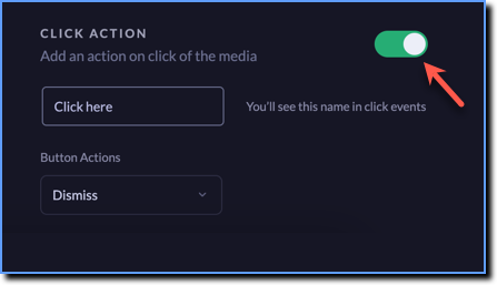
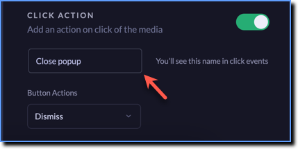
- Enable the CLICK ACTION toggle to link any action to your image. Clicking the image triggers the action that you configure.
| Button Action | Description |
|---|---|
| Dismiss | When the user clicks the media, the Full Screen is dismissed from the app screen |
| External Link | When the user clicks the media, they are routed to the URL that is attached to the media |
| Deep Link | When the user clicks the media, they are routed to the app screen within the same app that is attached to the media |
Provide a name for the action you add to your media using which you track the analytics on how many users are clicking the media.
- Align the Media to the top or bottom, add any content block, or delete the Media section using the action bar.

-
Customize the button that appears on your Full Screen. Choose to have one or two buttons, adjust the button width, alignment, height, radius, and the bottom margin.

-
Click the BUTTON dropdown to customize the individual buttons. Change the button color, stroke of the button outline, text, font family, font size, font weight, and button action. Also add user property to personalize the experience for your end user.

Configure the following button actions:
| Button Action | Description |
|---|---|
| Dismiss | When the user clicks the button, the Carousel is dismissed from the app screen |
| Next | When the user clicks the button, the Carousel moves to the next slide |
| Previous | When the user clicks the button, the Carousel moves back to the previous slide |
| External Link | When the user clicks the button, they are routed to the URL that is attached to the media |
| Deep Link | When the user clicks the button, they are routed to the app screen within the same app that is attached to the media |
-
Align the Buttons to the top or bottom, add any content block, or delete the Buttons using the action bar.

- Click the Layout option on the left, or the Edit icon.

In the Layout section, do the following:
-
Add a Background Color to your Carousel Slide.

-
Add a Close button to dismiss the entire Carousel.

-
Add or remove Swipe ability, Arrows, and Progress dots in your Carousel.

-
Click Done.

The Carousel you create is automatically saved.
-
Preview projects on a device before making it live for your end users.
-
After creating and designing the Full Screen, click Publish to make the Full Screen live for your end users. For more information on publishing Whatfix Mobile content, see Publish Whatfix Mobile content.